ProConstruc · Residential construction · Knowlton, Québec · 2026
Premium positioning without a rebrand.
A residential builder heading into its 40th year, with real craft and a brand that undersold it. ProConstruc didn't need a new logo. It needed a direction: where the company wants to stand in 2030, and a plan to get there.
One five-year road map, one identity refresh, one website. The owners are pulling it all together as we speak.
Client · ProConstruc
Mandate · Five-year strategic marketing plan, visual identity refresh, website, weekly working session
Year · 2026, ongoing
Crew · Phil Henderson (strategy, copy, art direction, website) [design credit to confirm]
Languages · FR first, EN alongside
01 · We thought it.
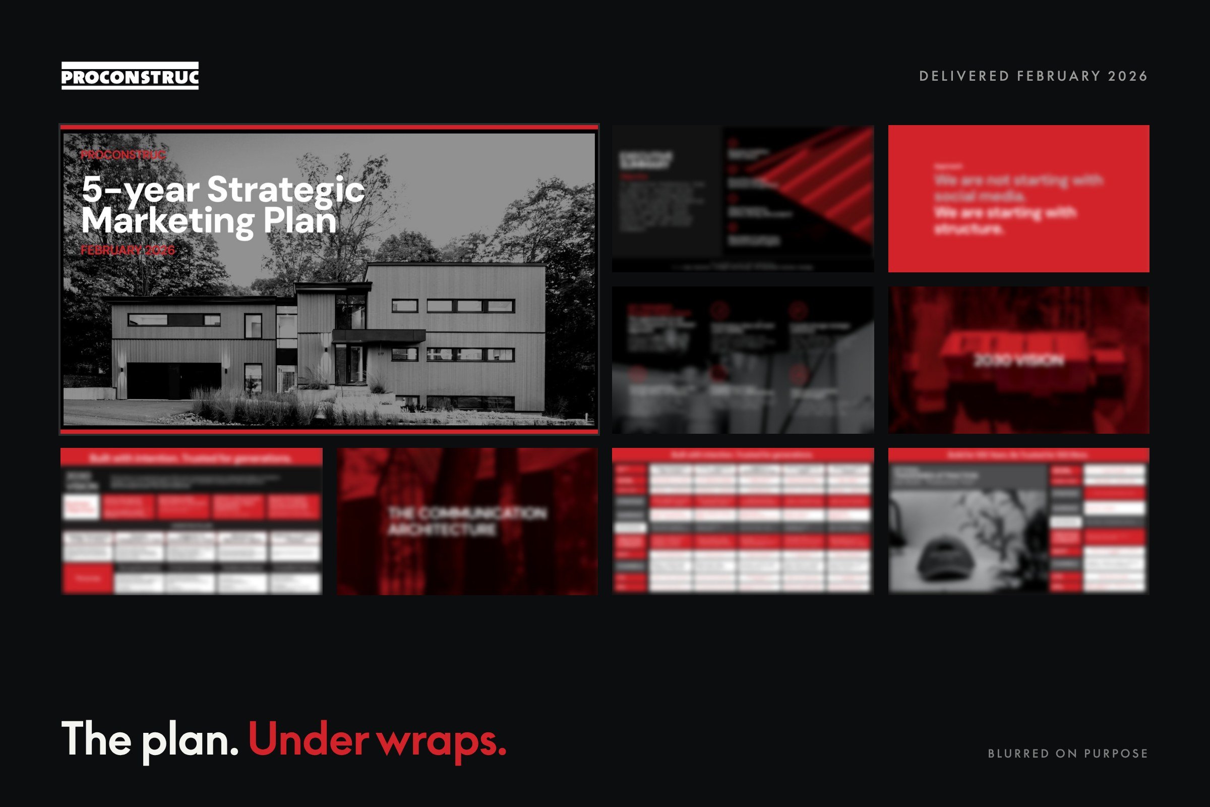
A five-year strategic marketing plan, built with the owners and delivered in February 2026: the 2030 vision, the business objectives behind it, who the company builds for, and the pillars that connect that ambition to what gets said on a Monday morning. We started with structure, not with social media.
02 · We made it.
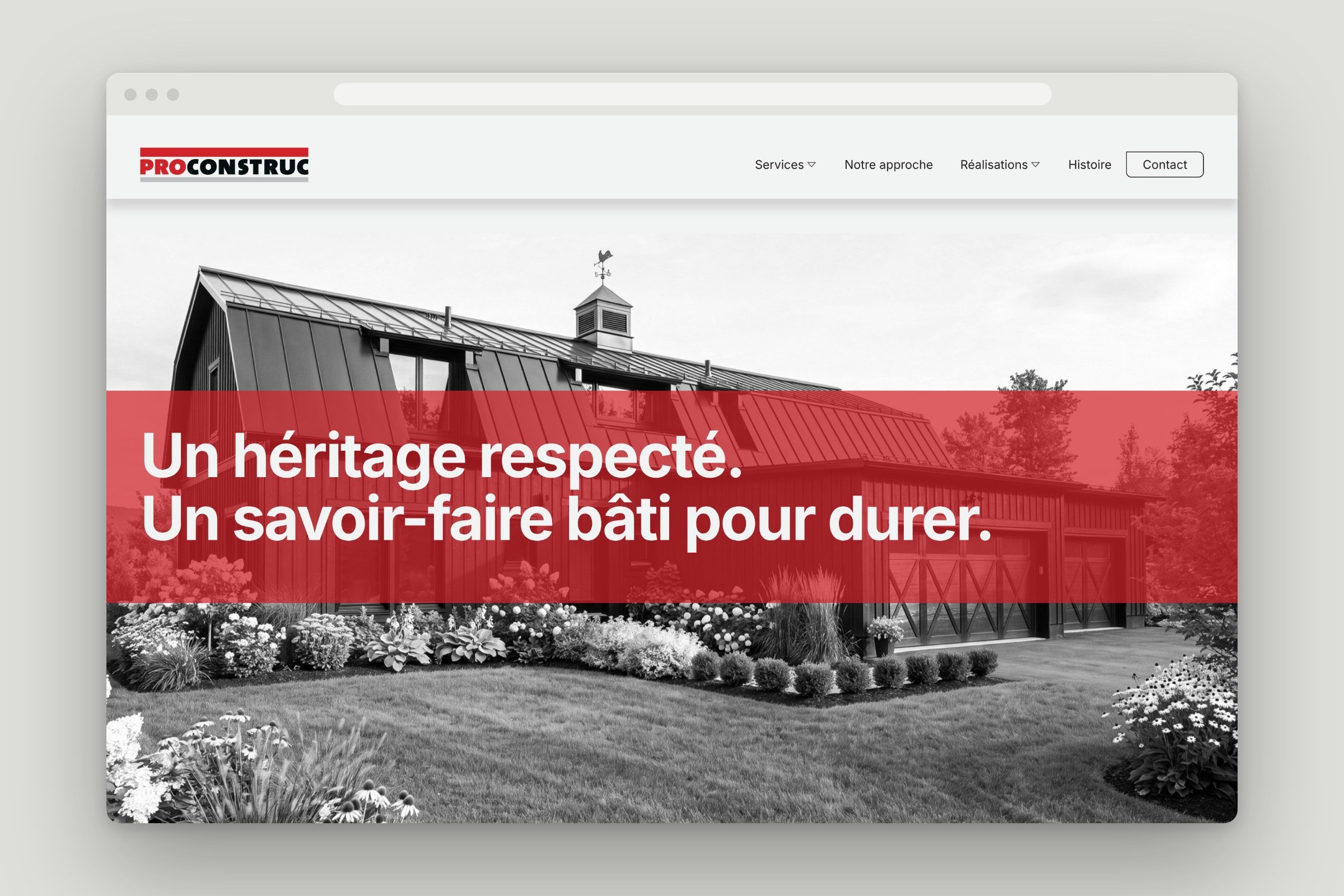
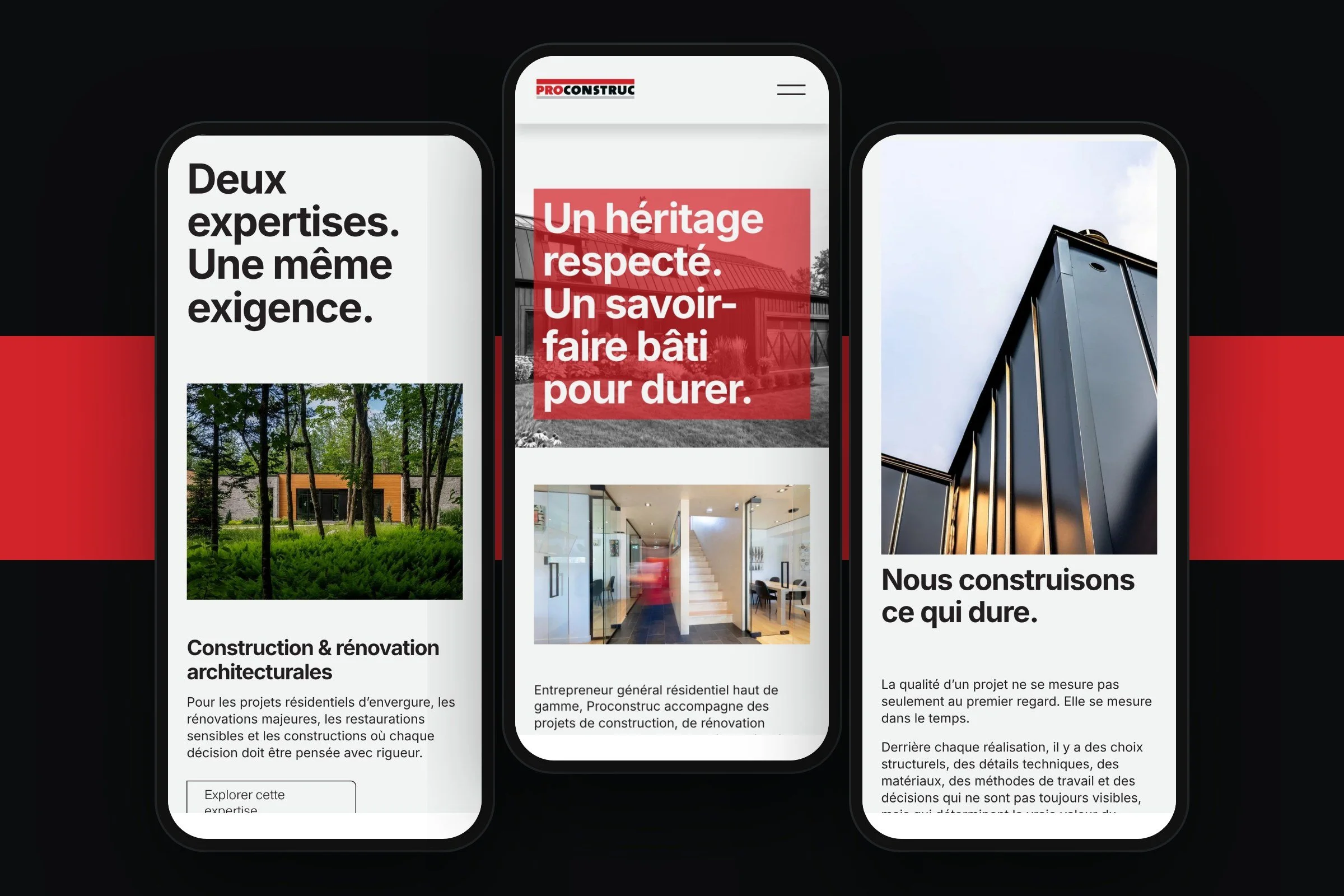
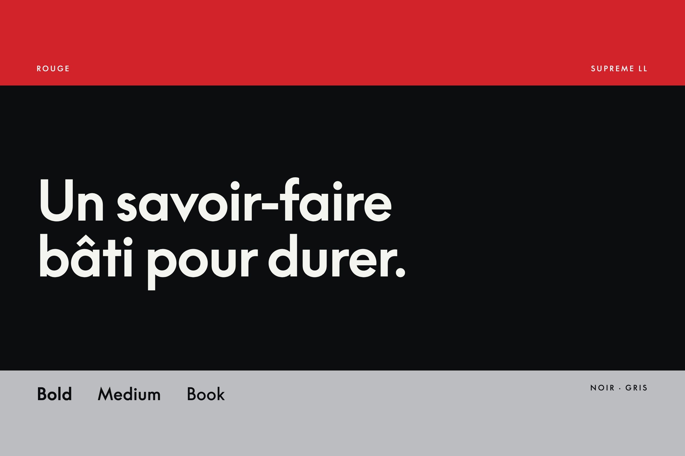
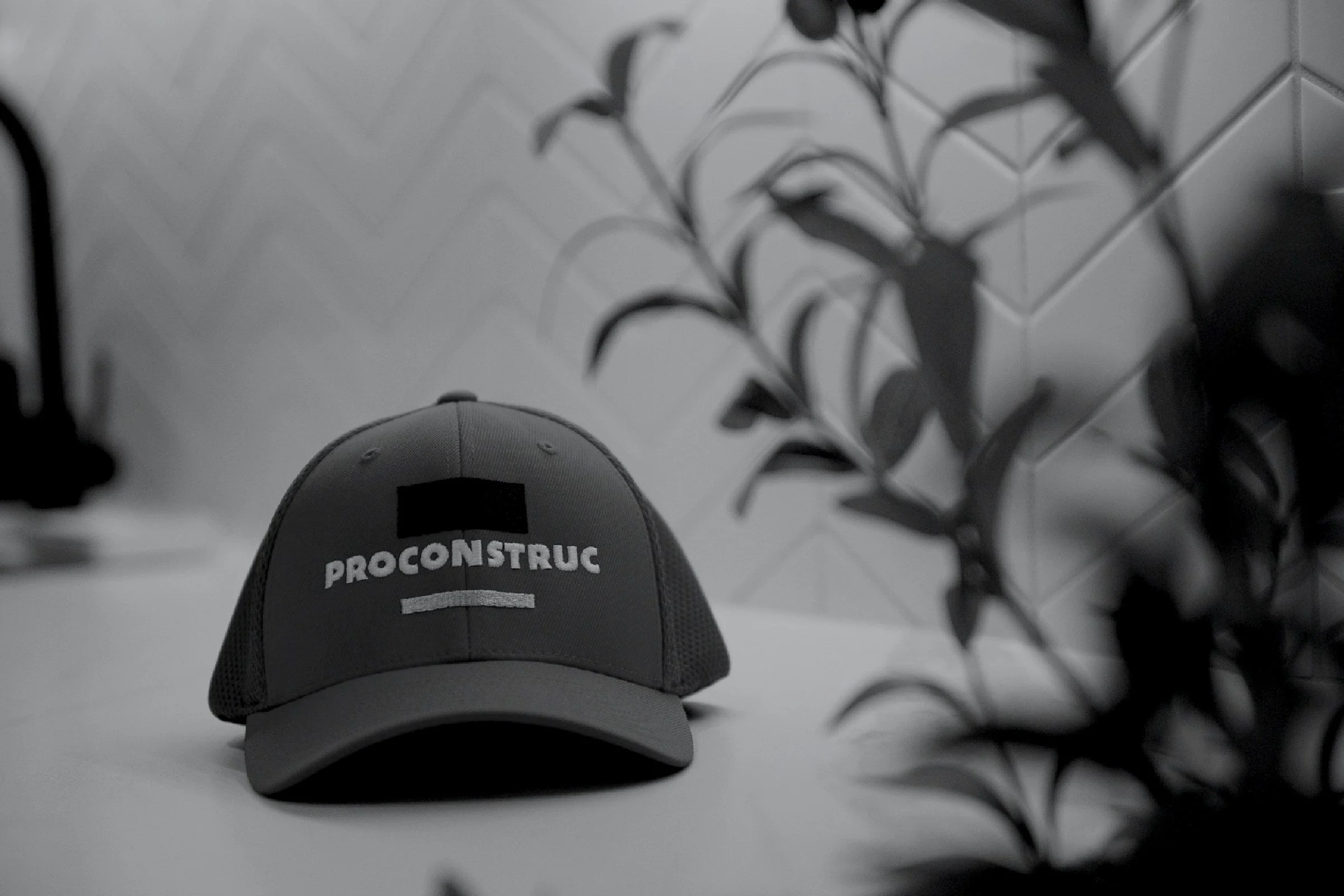
The visual identity refreshed, not replaced: the logo cleaned up, the red, black and grey bands put to work, a new typeface. Then everything it touches, from crew hats and apparel to the sign on the building, and a new website written in French first, built on Squarespace with Weglot for the English version so the team can run it without us.
03 · We launched it.
The road map is in motion. The crew is wearing the new identity, the office sign is being redone, and the website is in final review before a soft launch. We still sit down with the owners every week to keep the plan moving. Premium that reads as confidence, not as a costume.
Results
1 five-year road map · 1 identity refresh · 1 bilingual website
Credits
Strategy, copy, direction · Phil Henderson, PHLIK
Design · PHLIK
Client team · Tim Whitehead and Katherine Jacques, ProConstruc
Thanks · The crews who let us photograph the job sites
The road map
Five years, mapped. Now in motion.
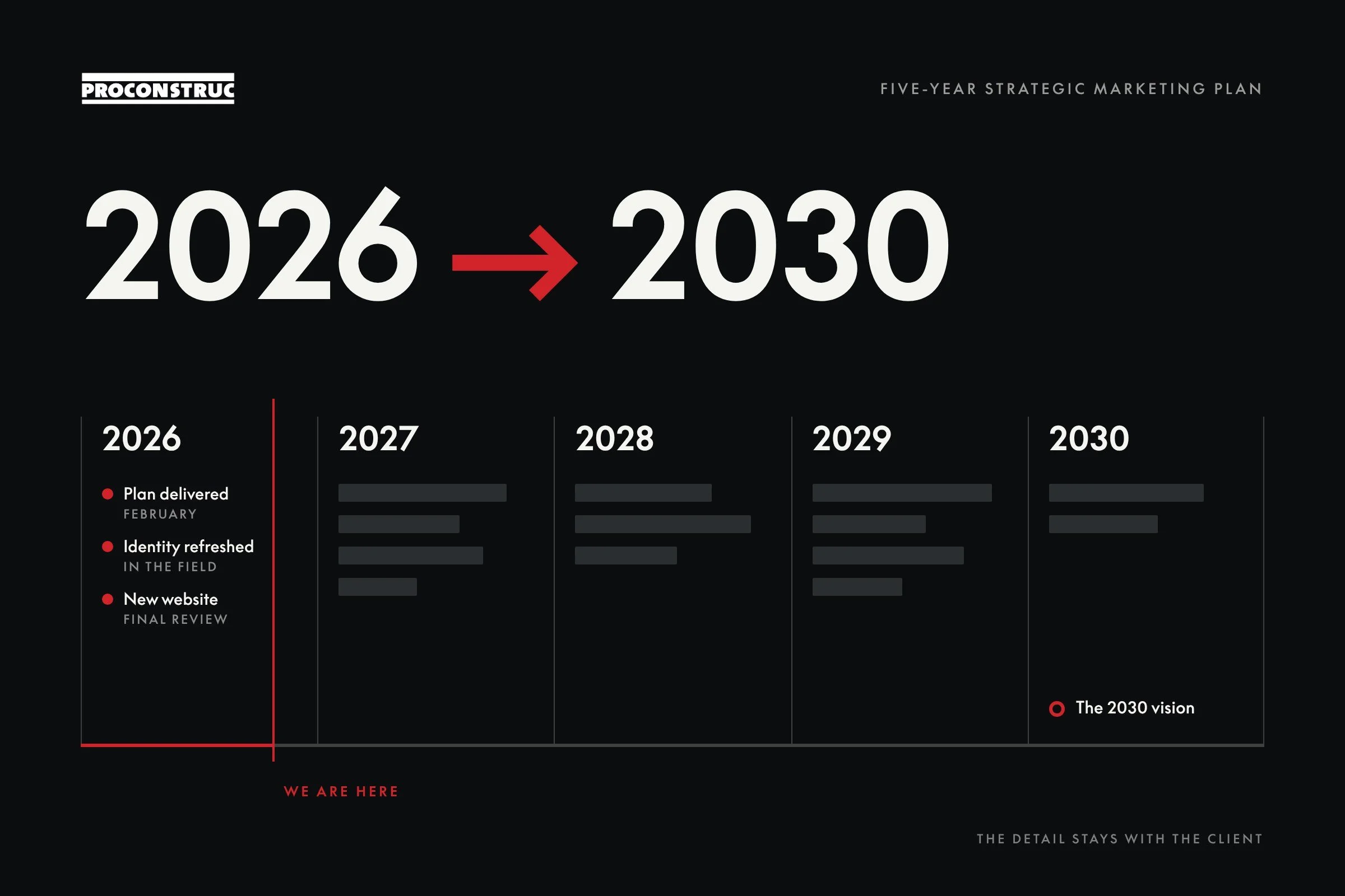
In February 2026 we handed the owners a five-year strategic marketing plan: where ProConstruc stands in 2030, and what has to be true each year to get there. The content stays with them. What we can show is its shape, and that it's being built: the identity is out in the field, the website is about to go live, and the next pieces are already on the calendar.
The identity
Same name.
Sharper everything.
Nearly forty years of reputation sit in that wordmark, so we kept it. We cleaned up the logo, set the red, black and grey as a system, chose one typeface, and rolled it onto the things people actually see: hats, apparel, signage, email signatures.
The website
The website. LAUNCHED.
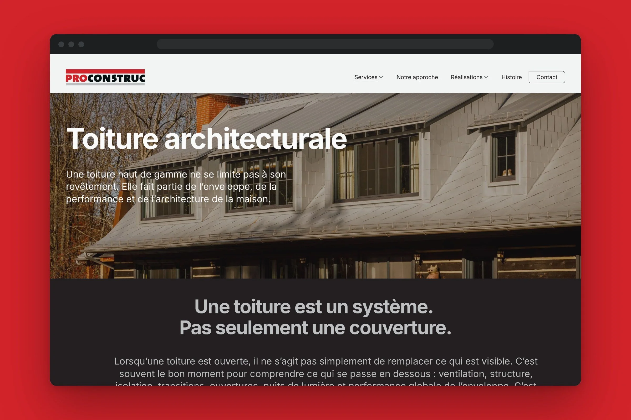
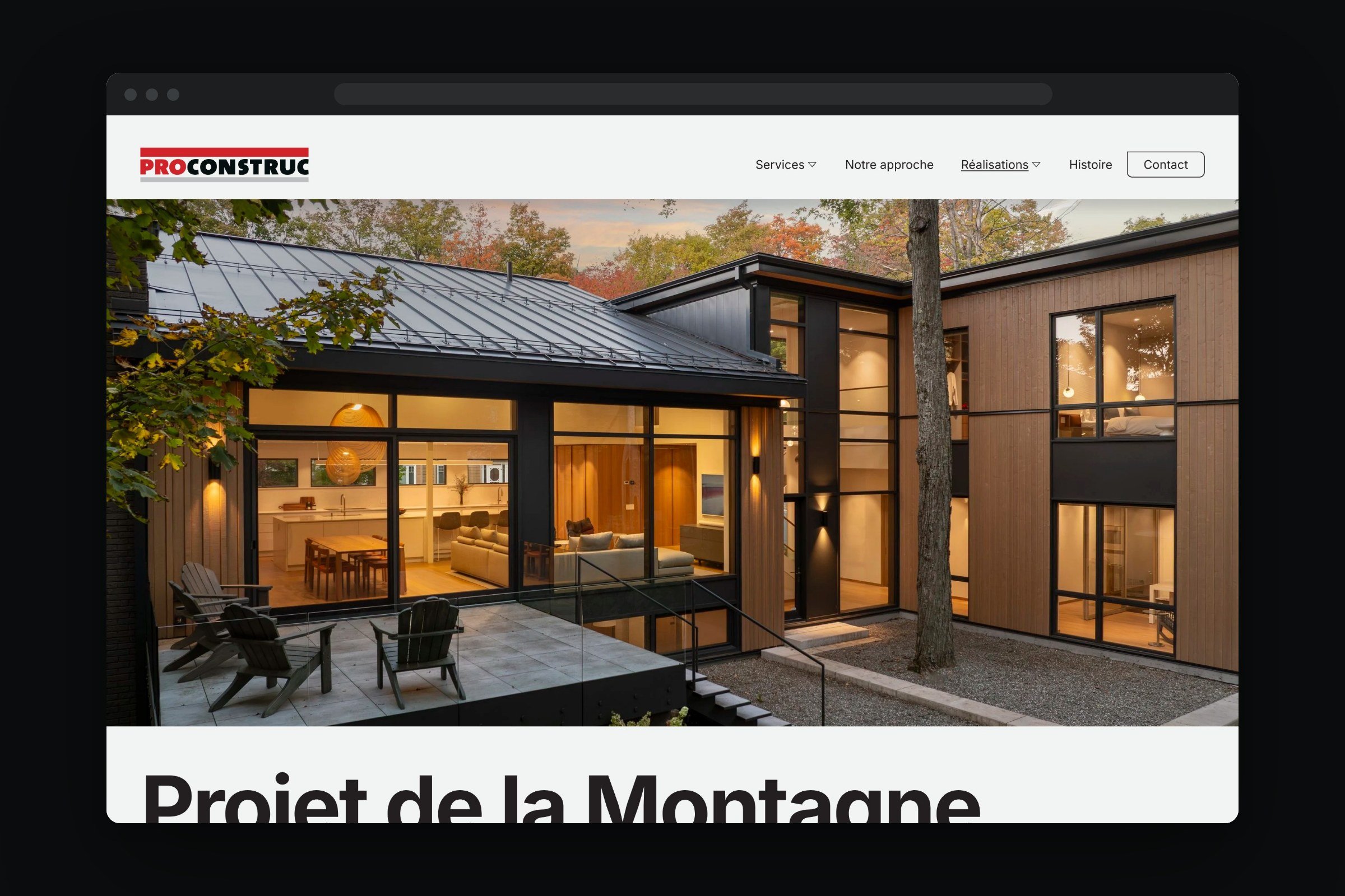
Two expertises, the projects, the approach and the family history, in a site that finally looks like the work. Written in French first with English alongside, and built so the team can update it without us. Soft launch is days away.